Why This Slide Is Useful
This slide is useful for management audiences who need to interpret complex data quickly. The visual format simplifies understanding of how different segments evolve over time, supporting strategic decision-making. It enables executives to identify patterns or anomalies in quarterly performance without delving into detailed spreadsheets.
For consultants, this slide offers a clear way to communicate progress or issues within a client’s operations. The consistent structure allows for easy benchmarking across periods, making it straightforward to highlight shifts or stability in key metrics. It also supports storytelling by visually emphasizing changes in data proportions.
Targeted at senior leaders, this slide can be integrated into presentations for board meetings or stakeholder updates. Its visual clarity helps convey complex data stories succinctly, fostering informed discussions. The use of color-coded legends and bullet points ensures the message remains accessible even in high-pressure environments.
Furthermore, the slide’s format lends itself to iterative updates. Teams can replace the placeholder text with specific data points, maintaining a standardized visual language across reports. This consistency enhances comprehension and reduces misinterpretation during strategic reviews or performance reviews.
How This Slide Is Used
This slide is typically used in performance reviews, quarterly reporting, or project status updates. Managers leverage it to illustrate how different segments or initiatives perform over time, often highlighting areas of concern or success.
In strategic planning sessions, consultants may use this slide to demonstrate the impact of specific interventions or market shifts. The visual comparison across quarters helps identify trends that inform future strategies or resource allocations.
During operational reviews, teams might update the pie charts with real-time data, providing a snapshot of current performance. This allows decision-makers to quickly assess whether targets are being met or if corrective actions are necessary.
The slide also supports stakeholder communication, especially when presenting to non-technical audiences. The combination of pie charts, color coding, and bullet points makes complex data accessible, enabling clear and concise messaging. It can be adapted for digital dashboards or embedded into broader reports for ongoing monitoring.
Related PPT Slides

Data Dashboard Overview PPT Slide
This slide showcases a data dashboard with multiple visualizations, including bar charts, a pie chart, and a line graph. It consolidates key metrics and performance indicators into a single view, enabling quick assessment of different data dimensions. The layout emphasizes clarity and ease of interpretation for decision-makers.

Data Dashboard Overview PPT Slide
This slide displays a data dashboard comprising various visual elements such as gauges, bar charts, line graphs, and financial summaries. It provides a consolidated view of key performance indicators, financial metrics, and trend analyses, designed to support quick decision-making and performance tracking at the management level.

Performance Dashboard Overview PPT Slide
This slide displays a set of visual metrics including a bar chart, gauge charts, and a financial figure, designed to provide a quick snapshot of key performance indicators. It combines graphical data representations with supporting text to facilitate rapid assessment of performance trends and variances across different dimensions.

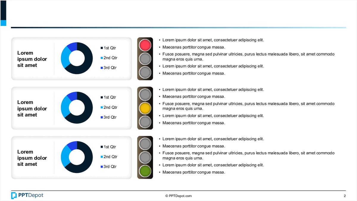
Data Visualization of Percentages PPT Slide
This slide displays 5 circular charts, each illustrating a different percentage value with varying color schemes. Accompanying each chart is placeholder text, suggesting a focus on data representation and interpretation for diverse metrics or categories. The layout emphasizes visual clarity and quick comprehension of proportional data.
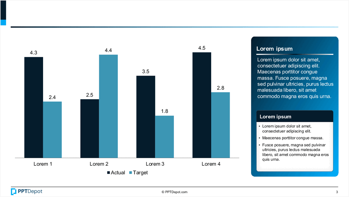
Performance Comparison Chart PPT Slide
This slide displays a bar chart comparing actual versus target values across 4 categories labeled "Lorem 1" through "Lorem 4." It includes a text box with placeholder content and a legend indicating the data series. The visual emphasizes performance gaps and progress tracking for strategic review.
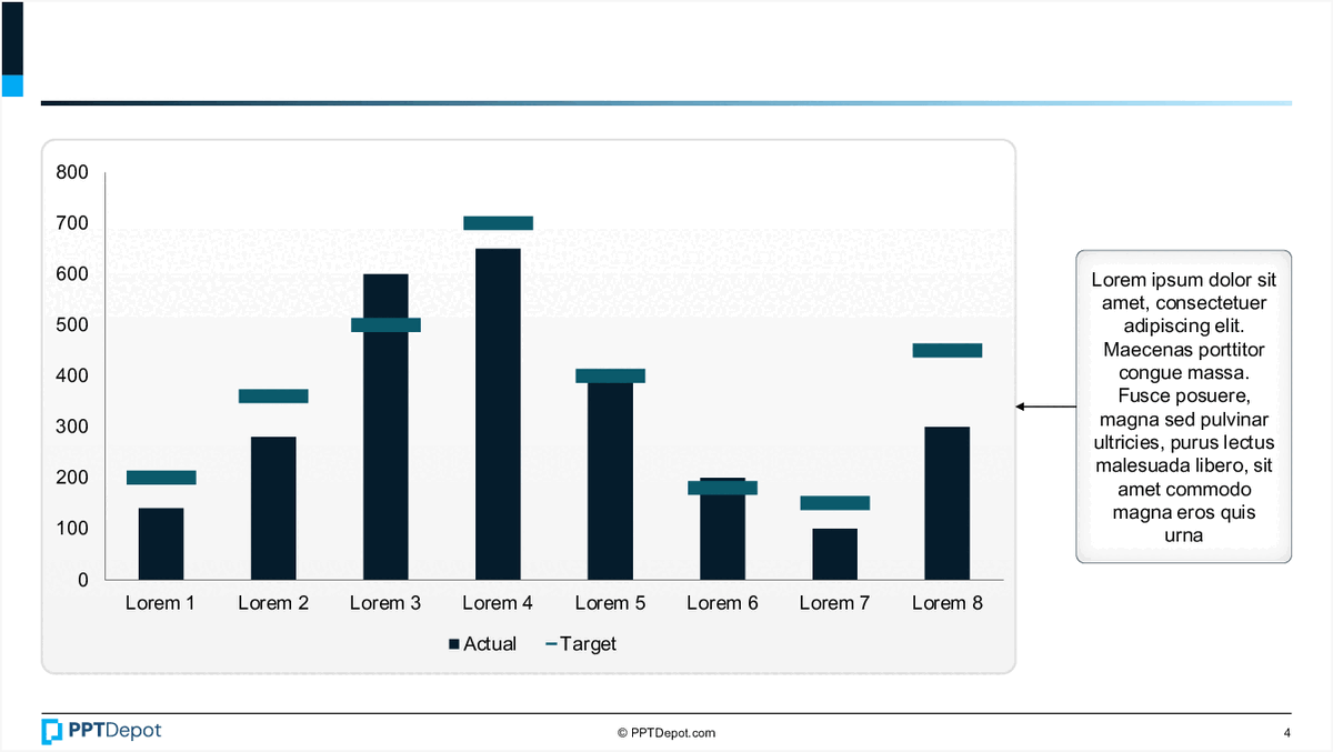
Bar Chart with Annotations PPT Slide
This slide displays a comparative bar chart illustrating actual versus target values across eight categories labeled Lorem 1 through Lorem 8. It includes a side annotation box with placeholder text, providing additional context or insights related to the data presented. The visual emphasizes differences between actual and target metrics in a clear, concise format suitable for executive review.
Explore Slides by Tags
Download our FREE collection of over 50+ high-impact, fully editable PowerPoint templates. These professional templates cover a comprehensive range of strategic analysis frameworks—including Strategy Formulation, Innovation, Digital Transformation, Change Management, and many others—ideal for Management Consultants, Investment Bankers, Strategy Professionals, and Business Executives.
Trusted by Leading Global Organizations
Our templates are trusted by thousands of organizations worldwide, including leading brands such as those listed below.
Related Templates from PPT Depot


Leverage our domain and design expertise. Become a subscriber today:
Each presentation is available in 3 color schemes. Download the version that most fits your firm's branding and customize it further once you download the PPTX file.

![]()
PPT Depot is your subscription to high-impact management consulting and investment banking templates—crafted from real-world deliverables by ex-MBB consultants and designed by former McKinsey Visual Graphics (VGI) presentation specialists. Compare plans here to determine what's the best fit for your firm.
With 15 years of experience, the team behind PPT Depot has empowered over 500+ clients across over 30+ countries. We currently produce 200,000 slides annually.
PPT Depot releases new templates each week. We have management topic-focused templates (e.g. market analysis, strategic planning, digital transformation, and more), alongside industry-specific collections. Peruse our full inventory here.
Save time and effort—elevate your presentations with proven domain and design expertise.
Got a question? Email us at [email protected].
Related Consulting Presentations
These presentations below are available for individual purchase from Flevy , the marketplace for business best practices.

Slide Customization & Production
We provide tailored slide customization and production services:
- Conversion of scanned notes into PowerPoint slides
- Development of PowerPoint master template
- Creation of data-driven PowerPoint charts from hand-drawn graphs
- Conversion of Excel charts to PowerPoint charts
- Conversion of other file formats (e.g. PDF, TIF, Word Doc) to PowerPoint slides
- Conversion of PowerPoint slides from one master template to another
- Visual enhancement of existing PowerPoint presentations to increase the professional look of the presentation