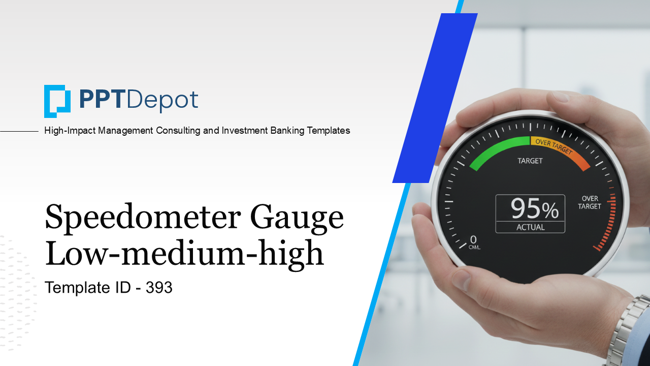
Why This Slide Is Useful
This slide is useful because it offers a clear visual summary of performance or risk status, enabling leaders to quickly assess areas that require attention. The color-coded gauge simplifies complex data into an easily interpretable format, making it ideal for executive dashboards, performance reviews, or strategic updates. It helps facilitate rapid decision-making by highlighting where focus is needed most.
For C-level executives and senior managers, this slide provides a straightforward way to monitor key metrics without getting bogged down in detailed data. It supports high-level discussions about operational health, project progress, or strategic risks, making it easier to prioritize initiatives or allocate resources effectively.
Management consultants can leverage this slide during client engagements to present performance diagnostics succinctly. It can be customized to reflect specific KPIs or operational areas, providing a visual anchor for strategic recommendations or performance improvement plans. Its simplicity ensures that stakeholders at all levels grasp the current state instantly.
In performance management or reporting contexts, this gauge can be integrated into broader dashboards or executive summaries. It acts as a quick reference point, prompting deeper dives into underlying data when performance shifts into yellow or red zones. This visual cue promotes proactive management and timely interventions.
How This Slide Is Used
This slide is typically used in performance reviews, operational dashboards, or risk assessments. Leaders rely on it to communicate the current status of key initiatives or metrics during executive meetings or board presentations.
In strategic planning sessions, the gauge helps teams visualize progress toward targets or thresholds. For example, a sales team might use it to track quarterly revenue performance, with the needle indicating whether results are on track, at risk, or exceeding expectations.
Consultants often customize this slide to fit client-specific KPIs, adjusting the labels and thresholds to match strategic priorities. It can also serve as a baseline for tracking improvements over time, with the needle moving across the spectrum as initiatives mature.
Additionally, this slide supports real-time monitoring in digital dashboards, where automated data feeds update the gauge dynamically. This allows decision-makers to respond swiftly to emerging issues or opportunities, maintaining strategic agility.
Related PPT Slides

Executive Summary Performance Highlights PPT Slide
This slide consolidates key operational metrics and initiatives, providing a snapshot of recent performance and ongoing efforts. It highlights achievements, risk areas, and progress on strategic actions, offering a comprehensive view tailored for executive decision-making and stakeholder communication.
Performance Metrics Dashboard PPT Slide
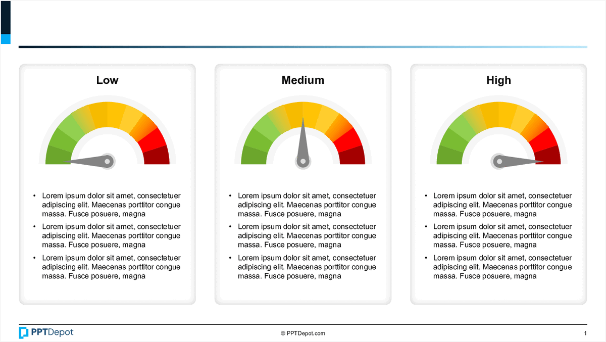
This slide displays 3 gauge charts representing different levels of performance—Low, Medium, and High—along with accompanying descriptive text sections. It provides a visual summary of key metrics, enabling quick assessment of performance status across multiple dimensions for executive decision-making.

Executive Summary Highlights PPT Slide
This slide summarizes key operational and compliance metrics across ten distinct initiatives or areas. It uses a numbered, visually engaging format to communicate progress, issues, and achievements, providing a quick reference for leadership and stakeholders to assess overall performance and identify focus points.

KPI Dashboard Metrics Overview PPT Slide
This slide displays key performance indicators (KPIs) related to subscriber retention, revenue, content costs, engagement, and ad growth. It provides definitions, their importance, and benchmarking data, offering a comprehensive view of operational and strategic metrics for a media or streaming platform. The structured format supports quick assessment of performance against industry standards.
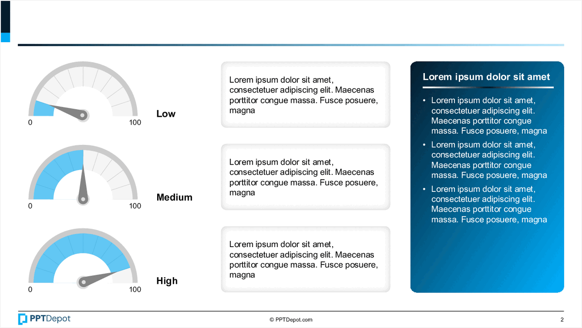
Performance Metrics Dashboard Overview PPT Slide
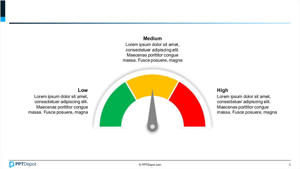
This slide displays a set of 3 gauge charts representing different levels of performance: Low, Medium, and High. Each gauge is accompanied by placeholder text, likely intended for detailed descriptions or key insights related to each performance level. The visual format emphasizes the variation in performance metrics across different areas or time periods, making it suitable for quick assessment by executive audiences.
Performance Metrics Dashboard Overview PPT Slide
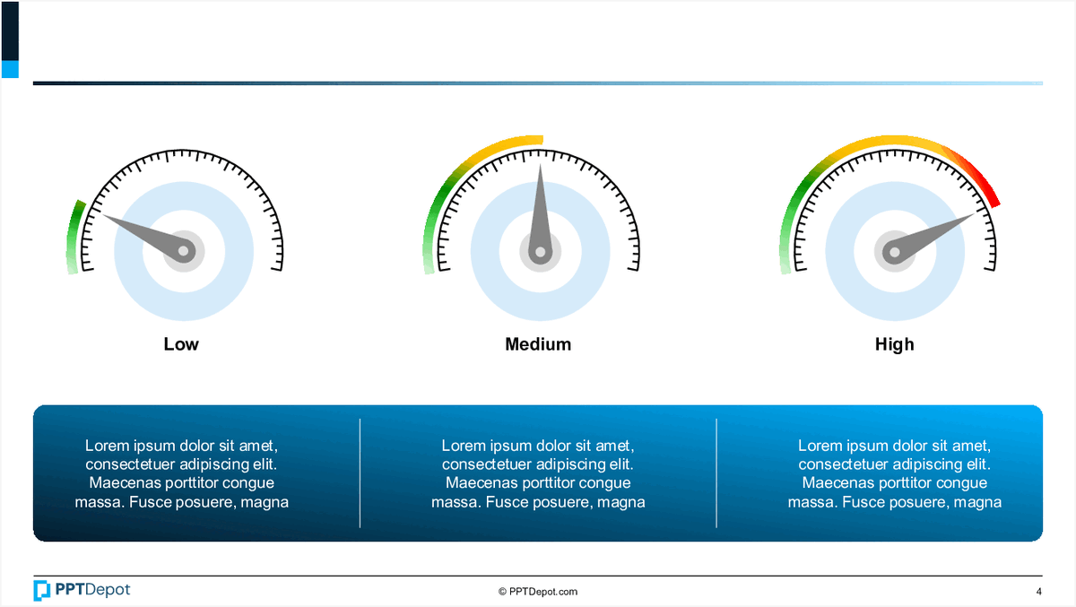
This slide displays a set of 3 performance gauges categorized as Low, Medium, and High, alongside corresponding text boxes and a blue informational panel. It aims to provide a visual summary of key performance indicators, with each gauge representing different levels of achievement or risk, complemented by descriptive content for context.
Explore Slides by Tags
Download our FREE collection of over 50+ high-impact, fully editable PowerPoint templates. These professional templates cover a comprehensive range of strategic analysis frameworks—including Strategy Formulation, Innovation, Digital Transformation, Change Management, and many others—ideal for Management Consultants, Investment Bankers, Strategy Professionals, and Business Executives.
Trusted by Leading Global Organizations
Our templates are trusted by thousands of organizations worldwide, including leading brands such as those listed below.
Related Templates from PPT Depot


Leverage our domain and design expertise. Become a subscriber today:
Each presentation is available in 3 color schemes. Download the version that most fits your firm's branding and customize it further once you download the PPTX file.

![]()
PPT Depot is your subscription to high-impact management consulting and investment banking templates—crafted from real-world deliverables by ex-MBB consultants and designed by former McKinsey Visual Graphics (VGI) presentation specialists. Compare plans here to determine what's the best fit for your firm.
With 15 years of experience, the team behind PPT Depot has empowered over 500+ clients across over 30+ countries. We currently produce 200,000 slides annually.
PPT Depot releases new templates each week. We have management topic-focused templates (e.g. market analysis, strategic planning, digital transformation, and more), alongside industry-specific collections. Peruse our full inventory here.
Save time and effort—elevate your presentations with proven domain and design expertise.
Got a question? Email us at [email protected].
Related Consulting Presentations
These presentations below are available for individual purchase from Flevy , the marketplace for business best practices.

Slide Customization & Production
We provide tailored slide customization and production services:
- Conversion of scanned notes into PowerPoint slides
- Development of PowerPoint master template
- Creation of data-driven PowerPoint charts from hand-drawn graphs
- Conversion of Excel charts to PowerPoint charts
- Conversion of other file formats (e.g. PDF, TIF, Word Doc) to PowerPoint slides
- Conversion of PowerPoint slides from one master template to another
- Visual enhancement of existing PowerPoint presentations to increase the professional look of the presentation