
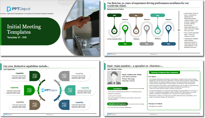
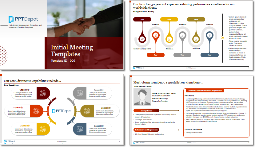
Why This Slide Is Useful
This slide is valuable because it highlights best practices in data visualization, essential for strategic decision-making. The use of a progress bar and segmented bullet points helps distill detailed information into easily digestible parts, enabling leaders to grasp key points rapidly. For management consultants and strategists, this approach supports effective storytelling and stakeholder engagement by making data more accessible and compelling.
The color-coded text box adds emphasis to critical insights, guiding the audience’s focus to the most relevant content. This visual hierarchy improves comprehension and retention, especially during high-stakes presentations or strategic reviews. It also demonstrates a disciplined approach to information design, which is crucial when communicating complex analyses to C-level executives.
Furthermore, this slide exemplifies how visual tools can be integrated into broader reporting frameworks. It can be adapted for dashboards, executive summaries, or client deliverables, ensuring consistency in visual language. The combination of graphics and text supports a narrative that is both data-driven and visually engaging, which is essential for influencing decision-makers.
Finally, the layout encourages a structured storytelling approach, where each element builds on the previous one. This sequencing helps guide the audience through the analysis, from initial context to detailed insights, culminating in a clear call to action or conclusion. Such clarity is vital for aligning leadership around strategic initiatives or operational improvements.
How This Slide Is Used
This slide is typically used in strategic presentations, performance reviews, or client reporting. It serves as a template for illustrating progress, status updates, or key findings in a visually appealing manner. Management consultants often customize it to fit specific project metrics or KPIs, replacing generic placeholders with client-specific data.
In client workshops, this slide helps facilitate discussions around project milestones or performance gaps. The progress indicator can be tailored to show current status against targets, prompting conversations about next steps or resource allocation. The bullet points provide supporting details, while the highlighted text box emphasizes critical insights or recommendations.
For internal executive briefings, this slide functions as a summary of complex data sets or project dashboards. It condenses large volumes of information into a format that supports quick decision-making. Leaders can use it to track ongoing initiatives, identify bottlenecks, or communicate strategic priorities succinctly.
In investor or board presentations, this layout supports storytelling by visually breaking down key performance drivers or risks. The combination of graphics and text ensures that even non-technical stakeholders can understand the core messages. It also allows for easy updates, making it suitable for recurring reporting cycles or progress tracking.
Related PPT Slides
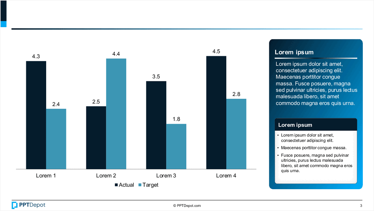
Performance Comparison Chart PPT Slide
This slide displays a bar chart comparing actual versus target values across 4 categories labeled "Lorem 1" through "Lorem 4." It includes a text box with placeholder content and a legend indicating the data series. The visual emphasizes performance gaps and progress tracking for strategic review.
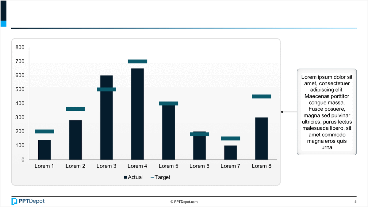
Bar Chart with Annotations PPT Slide
This slide displays a comparative bar chart illustrating actual versus target values across eight categories labeled Lorem 1 through Lorem 8. It includes a side annotation box with placeholder text, providing additional context or insights related to the data presented. The visual emphasizes differences between actual and target metrics in a clear, concise format suitable for executive review.
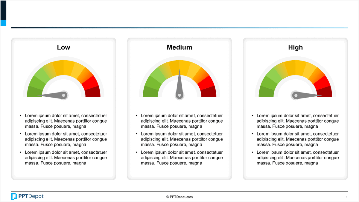
Performance Metrics Dashboard Overview PPT Slide
This slide displays a set of 3 gauge charts representing different levels of performance: Low, Medium, and High. Each gauge is accompanied by placeholder text, likely intended for detailed descriptions or key insights related to each performance level. The visual format emphasizes the variation in performance metrics across different areas or time periods, making it suitable for quick assessment by executive audiences.
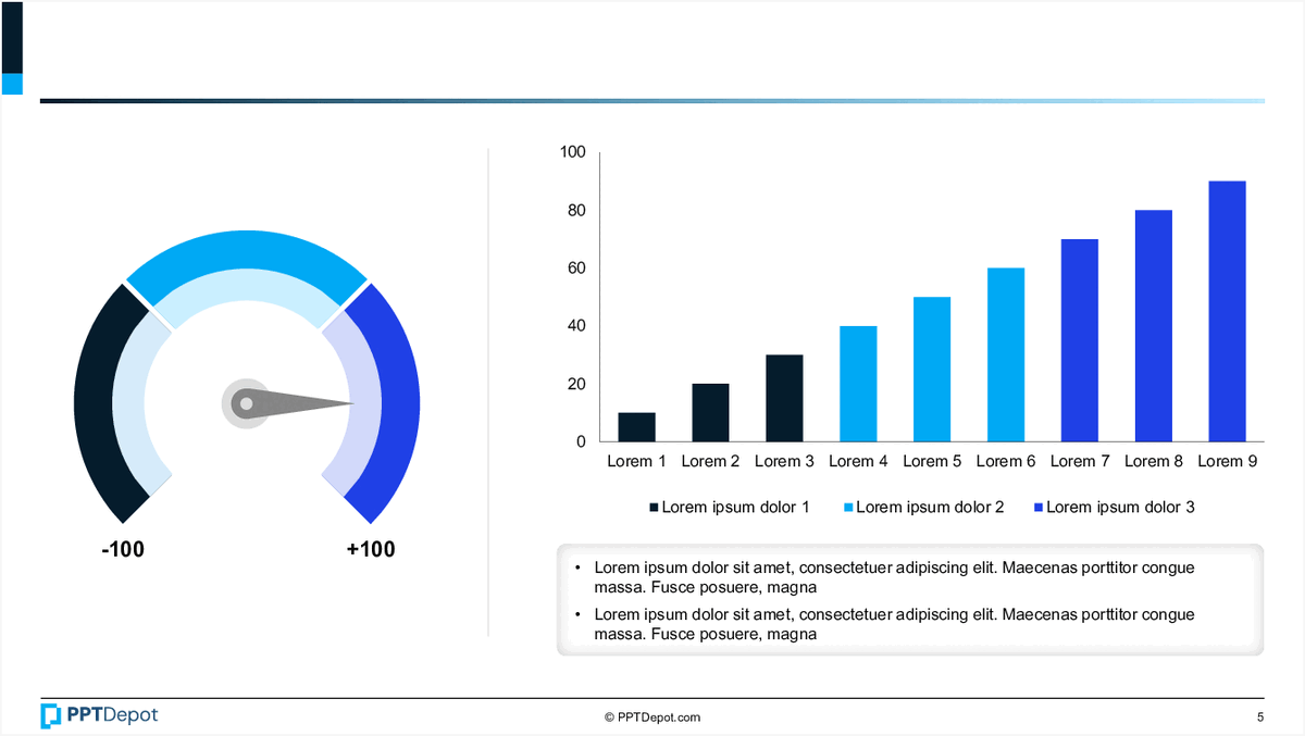
Performance Metrics Overview PPT Slide
This slide displays key performance indicators through visual tools, including a gauge chart and a bar chart, complemented by explanatory notes. It aims to provide a quick, data-driven snapshot of current performance levels and trends, tailored for executive review and strategic decision-making.
Quarterly Data Visualization PPT Slide
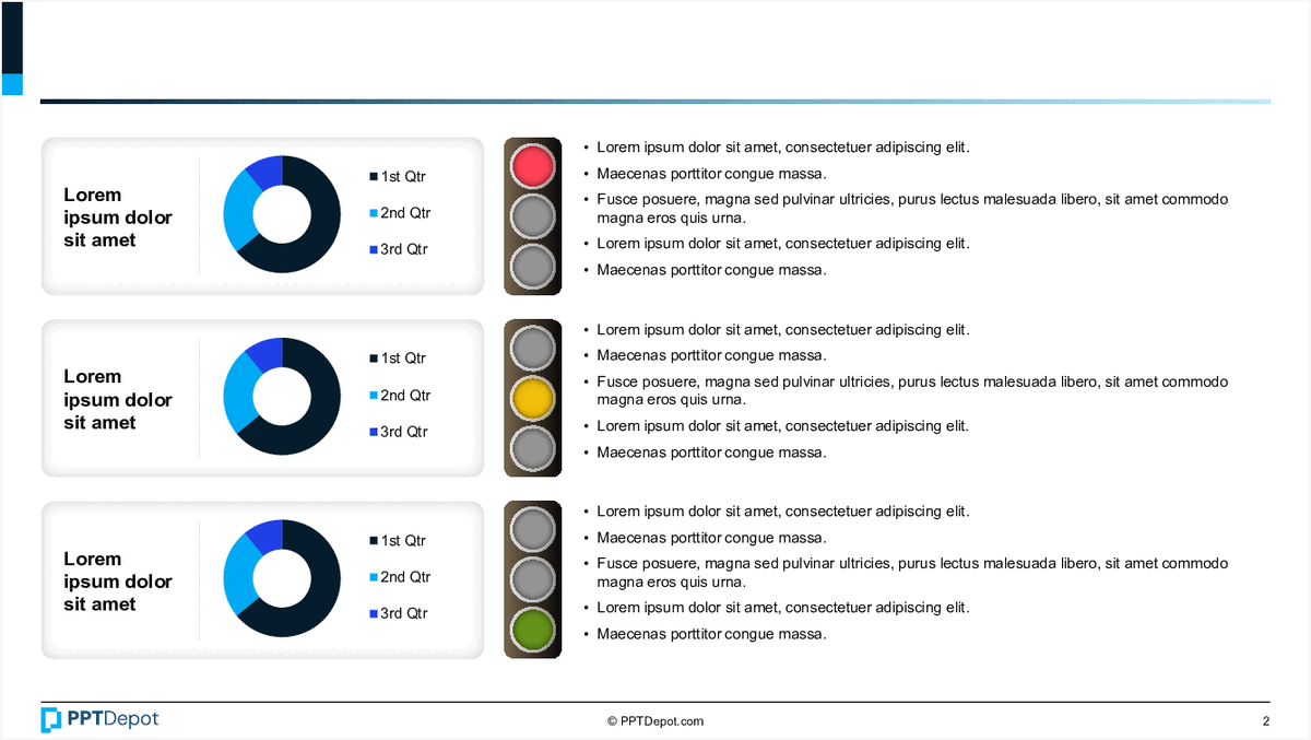
This slide displays 3 sets of pie charts representing quarterly data, each accompanied by a color-coded legend and descriptive bullet points. Its layout facilitates quick comparison of data segments across different time periods, making it suitable for performance tracking or trend analysis at a glance.

Data Visualization of Progress Metrics PPT Slide
This slide displays a circular, multi-layered chart illustrating percentage-based progress or achievement levels across different categories. Accompanying the chart are descriptive icons and text blocks that provide context, making it suitable for executive review of performance metrics or project status updates.
Explore Slides by Tags
Download our FREE collection of over 50+ high-impact, fully editable PowerPoint templates. These professional templates cover a comprehensive range of strategic analysis frameworks—including Strategy Formulation, Innovation, Digital Transformation, Change Management, and many others—ideal for Management Consultants, Investment Bankers, Strategy Professionals, and Business Executives.
Trusted by Leading Global Organizations
Our templates are trusted by thousands of organizations worldwide, including leading brands such as those listed below.
Related Templates from PPT Depot


Leverage our domain and design expertise. Become a subscriber today:
Each presentation is available in 3 color schemes. Download the version that most fits your firm's branding and customize it further once you download the PPTX file.

![]()
PPT Depot is your subscription to high-impact management consulting and investment banking templates—crafted from real-world deliverables by ex-MBB consultants and designed by former McKinsey Visual Graphics (VGI) presentation specialists. Compare plans here to determine what's the best fit for your firm.
With 15 years of experience, the team behind PPT Depot has empowered over 500+ clients across over 30+ countries. We currently produce 200,000 slides annually.
PPT Depot releases new templates each week. We have management topic-focused templates (e.g. market analysis, strategic planning, digital transformation, and more), alongside industry-specific collections. Peruse our full inventory here.
Save time and effort—elevate your presentations with proven domain and design expertise.
Got a question? Email us at [email protected].
Related Consulting Presentations
These presentations below are available for individual purchase from Flevy , the marketplace for business best practices.

Slide Customization & Production
We provide tailored slide customization and production services:
- Conversion of scanned notes into PowerPoint slides
- Development of PowerPoint master template
- Creation of data-driven PowerPoint charts from hand-drawn graphs
- Conversion of Excel charts to PowerPoint charts
- Conversion of other file formats (e.g. PDF, TIF, Word Doc) to PowerPoint slides
- Conversion of PowerPoint slides from one master template to another
- Visual enhancement of existing PowerPoint presentations to increase the professional look of the presentation