Why This Slide Is Useful
This slide is useful because it consolidates critical performance indicators into a single view, enabling leaders to quickly assess operational health and identify areas requiring attention. The inclusion of variance percentages and reasons for change helps management understand underlying drivers behind volume fluctuations, supporting more informed decision-making.
For executives and senior managers, this slide offers a straightforward way to monitor service levels and customer satisfaction trends over time. It helps determine whether recent process improvements or issues are impacting customer interactions and whether corrective actions are necessary. The visual cues, such as color-coded variance, facilitate rapid interpretation during strategic reviews or operational meetings.
Management consultants and operational leaders can leverage this data to diagnose root causes of volume shifts. For example, a spike in email volumes or a decline in call abandonment rates might signal changes in customer behavior or service processes. This insight supports targeted interventions, such as staffing adjustments or process redesigns, to optimize service delivery.
Additionally, the slide supports ongoing performance tracking and benchmarking. By embedding this data into regular reporting routines, organizations can maintain visibility on progress toward SLA compliance and customer experience goals. It also serves as a foundation for deeper analysis, such as correlating volume trends with product launches, marketing campaigns, or external events.
How This Slide Is Used
This slide is typically used in operational reviews, performance management meetings, or continuous improvement initiatives. Leaders review the data to evaluate whether recent changes have improved service efficiency or customer satisfaction. It is also employed during root cause analysis sessions to understand volume fluctuations and their impact on staffing and resource allocation.
In consulting engagements, this slide often forms part of a broader performance dashboard. Consultants analyze the data to identify operational bottlenecks or areas where process automation could reduce volume pressures. They may also use it to recommend adjustments in staffing levels or technology investments to better handle customer demand.
Customer service teams utilize this slide to monitor their day-to-day performance and ensure SLA adherence. For instance, a sudden increase in tickets resolved or aging tickets might trigger immediate operational responses. The data helps prioritize issues and allocate resources effectively during peak periods or service disruptions.
Finally, this slide supports strategic planning by providing trend insights that inform capacity planning and customer experience initiatives. Organizations can forecast future volume changes based on historical patterns, enabling proactive adjustments to staffing, training, or technology investments. It also offers a baseline for measuring the impact of strategic initiatives aimed at improving customer engagement.
Related PPT Slides

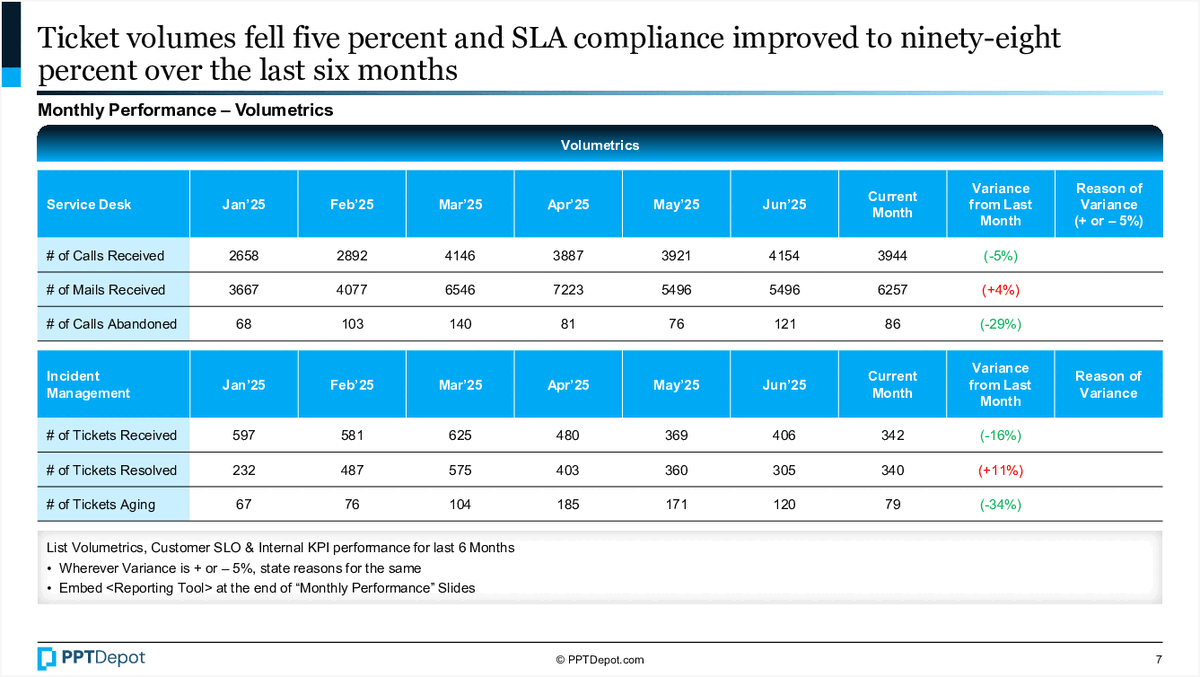
Service Desk Performance Metrics PPT Slide
This slide displays key performance indicators for a service desk over a six-month period, highlighting volume trends and variance from targets. It compares call and email volumes, as well as incident management metrics like tickets received, resolved, and aging, providing a comprehensive view of operational performance and SLA compliance.

Service Level Performance Dashboard PPT Slide
This slide displays a performance tracking dashboard for service levels and key performance indicators (KPIs) across different service desks. It compares target metrics with actual results over several months, highlighting variances and reasons for deviations. The visual layout emphasizes areas of success and concern through color coding, aiding quick assessment by management teams.
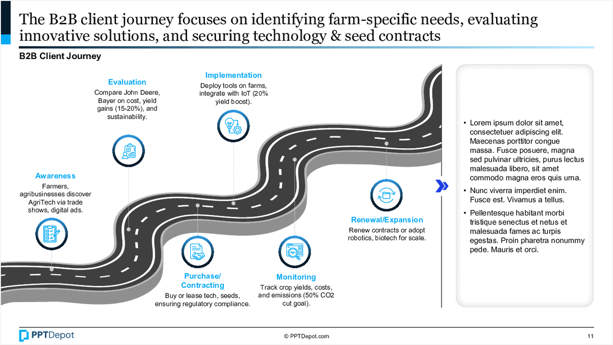
Biotech Industry Client Journey for Farm-Specific Solutions PPT Slide
This slide illustrates the stages of a B2B client journey within the biotech sector, focusing on farm-specific needs such as evaluating, deploying, and expanding innovative seed and seed contract solutions. It emphasizes key touchpoints from awareness to implementation, supported by visual icons and brief descriptions for each phase.

Customer Experience Model Overview PPT Slide
This slide illustrates Accenture's Nonstop Customer Experience Model, emphasizing the continuous cycle of customer engagement through various stages. It highlights how data and channels are unified to deliver personalized interactions, with a focus on the evaluation phase that bridges promise and delivery. The visual design supports quick comprehension for strategic decision-makers and customer experience leaders.

AgriTech KPIs for Crop Yield, Emissions, and Regulatory Timelin PPT Slide
This slide outlines key performance indicators (KPIs) relevant to AgriTech, focusing on crop yield improvements, emissions reduction, and regulatory approval timelines. It provides clear definitions, importance, and benchmark targets for each KPI, serving as a strategic measurement framework for operational and strategic decision-making in the sector.

Customer Journey Phases Overview PPT Slide
This slide illustrates the 6 key phases of the customer journey, highlighting interactions that influence acquisition, loyalty, and growth. It uses a visual flow with icons and brief descriptions to map the progression from initial contact through post-purchase engagement, emphasizing the importance of understanding each stage for strategic customer management.
Explore Slides by Tags
Download our FREE collection of over 50+ high-impact, fully editable PowerPoint templates. These professional templates cover a comprehensive range of strategic analysis frameworks—including Strategy Formulation, Innovation, Digital Transformation, Change Management, and many others—ideal for Management Consultants, Investment Bankers, Strategy Professionals, and Business Executives.
Trusted by Leading Global Organizations
Our templates are trusted by thousands of organizations worldwide, including leading brands such as those listed below.
Related Templates from PPT Depot


Leverage our domain and design expertise. Become a subscriber today:
Each presentation is available in 3 color schemes. Download the version that most fits your firm's branding and customize it further once you download the PPTX file.

![]()
PPT Depot is your subscription to high-impact management consulting and investment banking templates—crafted from real-world deliverables by ex-MBB consultants and designed by former McKinsey Visual Graphics (VGI) presentation specialists. Compare plans here to determine what's the best fit for your firm.
With 15 years of experience, the team behind PPT Depot has empowered over 500+ clients across over 30+ countries. We currently produce 200,000 slides annually.
PPT Depot releases new templates each week. We have management topic-focused templates (e.g. market analysis, strategic planning, digital transformation, and more), alongside industry-specific collections. Peruse our full inventory here.
Save time and effort—elevate your presentations with proven domain and design expertise.
Got a question? Email us at [email protected].
Related Consulting Presentations
These presentations below are available for individual purchase from Flevy , the marketplace for business best practices.

Slide Customization & Production
We provide tailored slide customization and production services:
- Conversion of scanned notes into PowerPoint slides
- Development of PowerPoint master template
- Creation of data-driven PowerPoint charts from hand-drawn graphs
- Conversion of Excel charts to PowerPoint charts
- Conversion of other file formats (e.g. PDF, TIF, Word Doc) to PowerPoint slides
- Conversion of PowerPoint slides from one master template to another
- Visual enhancement of existing PowerPoint presentations to increase the professional look of the presentation